Thursday, 3 May 2012
Thursday, 22 March 2012
Thursday, 15 March 2012
Edited Photo 3
 |
| Un-edited photo |
Friday, 9 March 2012
Thursday, 8 March 2012
Edited Photo 2
This is the unedited photo.
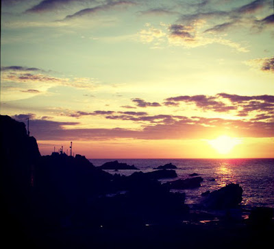
I have only edited this photo a little bit, to enhance the lighting. This makes the sky look brighter and the water looks more detailed. In the edited version, the cloud reflections look clearer, this helps to draw attention to the picture. Also the sun reflection at the front of the picture is brighter, this also helps to draw attention to the picture because it is an unusual aspect to be in a picture.
Friday, 2 March 2012
Edited Photo 1
This is the unedited version.
This is the edited version. I think this edit makes the photo look more interesting because it puts the main focus on the spider. It also catches the eye of a person looking at it more because it puts all of the focus onto the spider.
Thursday, 2 February 2012
Some Examples of some Close Up Photos
This is a good example because the photo is not completely focused, this draws attention to the part of the photo that is in focus. The difference in lighting also brings effect to the photo.
This photo is a good example of a close up because the object that is focused on is completely in focus and is the main subject of the close up.
This is also a good close up picture because there is nothing going on in the background, the picture is simply the leaf and the water droplet. Only part of the leaf is in focus which draws the viewer into looking at the water droplet.
Wednesday, 25 January 2012
Symmetrical Photographs
This photo is symmetrical because in the center of the photo there is a silhouette of a church tower, then either side there are trees of the same height and size roughly the same distance away from the church. The clouds above the church are also the same size, shape and width. But whereas the the silhouettes are vertically symmetrical, the clouds above the silhouettes are horizontally symmetrical because the clouds look very similar in most ways.
This photo isn't a completely symmetrical photo because even though the girls are stood in exactly the same position and are the same width away from the edge of the photo they are not wearing the same clothing, don't have the same hairstyle and are not the same height and weight.
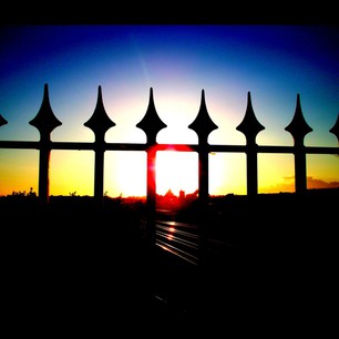
This photo is symmetrical because the bars of the fence are the same and there are the same amount of bars on either side of the photo. Also on the edges of the picture there are two parts of the pointed ends of the fence on either side of the photo. The sun is directly in the center of the picture, therefore the colours of the sky are distributed evenly and symmetrically as well.
Friday, 13 January 2012
Subscribe to:
Comments (Atom)


